> ## Documentation Index
> Fetch the complete documentation index at: https://help.kajabi.com/llms.txt
> Use this file to discover all available pages before exploring further.
# Optimize emails for mobile devices
> Preview and control how your emails display across desktop, tablet, and mobile devices.
## Overview
Kajabi email section types are responsive out of the box, meaning they automatically adjust to mobile devices.
For example, your email stacks vertically on mobile instead of horizontally as it would on desktop.
## Preview emails on different devices
In the editor, you can simulate different device types and see how your emails will look to your recipients. At the top of the editor, you'll see these options:
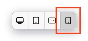 These buttons allow you to view how your email looks on a desktop, tablet, and mobile device.
## Control section settings for different devices
The section settings allow you to control, in detail, how your content adjusts to different devices. You can also hide certain elements if desired.
These buttons allow you to view how your email looks on a desktop, tablet, and mobile device.
## Control section settings for different devices
The section settings allow you to control, in detail, how your content adjusts to different devices. You can also hide certain elements if desired.
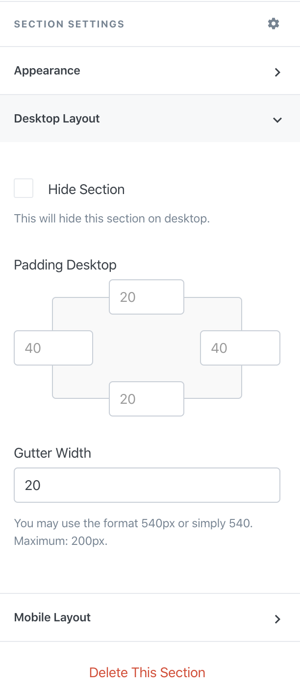 Previewing your layout on different devices is powerful when creating your email.
**Note:** We recommend [sending yourself a test email](/articles/marketing/email-campaigns/how-to-test-send-your-emails) to see exactly what your email will look like for your recipients.
Previewing your layout on different devices is powerful when creating your email.
**Note:** We recommend [sending yourself a test email](/articles/marketing/email-campaigns/how-to-test-send-your-emails) to see exactly what your email will look like for your recipients.