> ## Documentation Index
> Fetch the complete documentation index at: https://help.kajabi.com/llms.txt
> Use this file to discover all available pages before exploring further.
# Optimize font size in Email Campaigns
> Configure font sizes in an Email Campaign across desktop and mobile devices for the best reading experience.
Customizing your **font size** can be accomplished within the Text Box field. However, we recommend utilizing the Heading sizes to adjust your font size and have more control over the font size across desktop and mobile devices.
## Optimize font size
Adjust your font size to optimize the appearance of your email content across devices.
### Change the heading size of the font
1. Hover over the Text Section you wish to customize and click **Edit**.
2. Navigate to the sidebar and highlight the text you want to edit.
3. Click the **Header** dropdown menu.
4. Select the Header size you wish to use.
5. Click **Save** to keep your changes:
### Configure the font size for the chosen heading size for both desktop and mobile
1. Navigate **back** to the main sidebar editor.
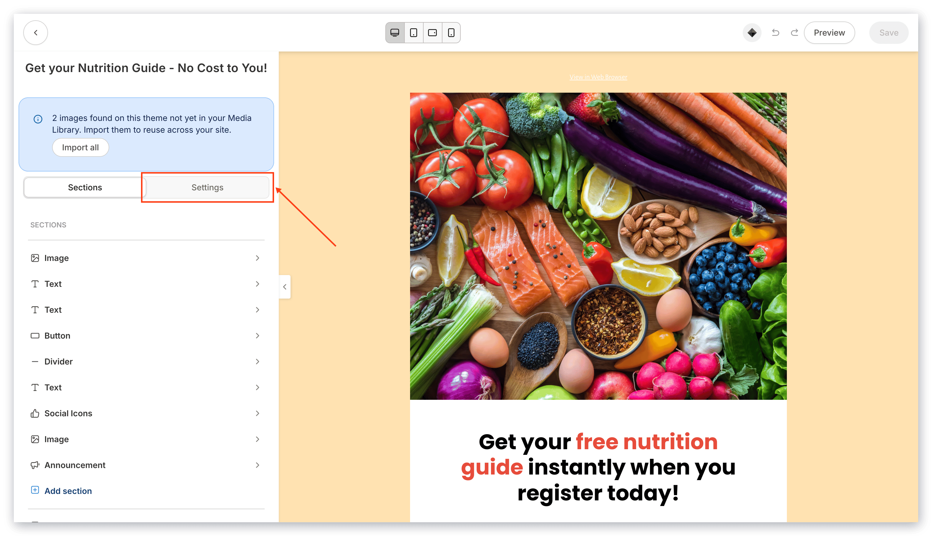
2. Click **Settings** in the top menu:
 ## Change the font size for desktop
### Desktop font size
1. Scroll down to the Desktop Font Sizes Section.
2. Locate the Heading size you selected (for example, h6).
3. Click the dropdown menu and select the pixel size for the Heading font size when viewed on a desktop device.
4. Click **Save** to apply and keep your changes.
5. Refer to your preview to see your font size as it would appear on a desktop device:
## Change the font size for desktop
### Desktop font size
1. Scroll down to the Desktop Font Sizes Section.
2. Locate the Heading size you selected (for example, h6).
3. Click the dropdown menu and select the pixel size for the Heading font size when viewed on a desktop device.
4. Click **Save** to apply and keep your changes.
5. Refer to your preview to see your font size as it would appear on a desktop device:
## Change the font size for mobile
### Mobile font size
1. Adjust your view to mobile by clicking the **Mobile** icon found in the top toolbar.
2. Navigate to the Mobile Font Sizes Section.
3. Locate the Heading size you selected (for example, h6).
4. Click the dropdown menu and select the pixel size for the Heading font size when viewed on a mobile device.
5. Click **Save** to apply and keep your changes.
6. Refer to your preview to see your font size as it would appear on a mobile device:
## Preview font size on different devices
1. Navigate to the top toolbar to select a device view.
2. Select **MOBILE** to see your font size as it would appear on a mobile device.
3. Select **DESKTOP** to see your font size as it would appear on a desktop device.
4. Once you have configured your font according to your email design vision on both mobile and desktop devices, click **Save** to keep your changes: