> ## Documentation Index
> Fetch the complete documentation index at: https://help.kajabi.com/llms.txt
> Use this file to discover all available pages before exploring further.
# Customize block layout settings
> Learn to adjust your block content visibility, alignment, spacing, and positioning of individual blocks to optimize your users' experience on different devices.
Learn to adjust your Block content visibility, alignment, spacing, and positioning of individual Blocks to optimize your users' experience when viewed on different devices (e.g., mobile or desktop).
***
## What are block layout settings?
Block Layout Settings, like [Section Layout Settings](/articles/website/pages/customizing-section-layout-settings), are the Desktop Layout and Mobile Layout Settings to optimize your page for desktop and mobile devices. However, with Block Layout Settings, you can optimize individual Blocks:
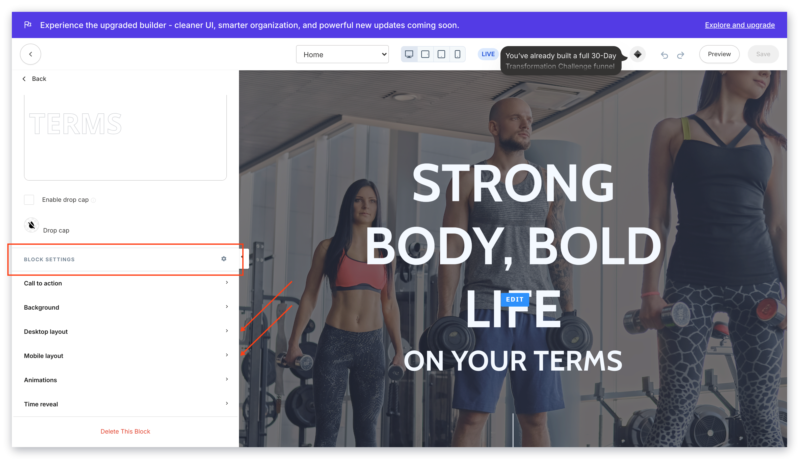 **Looking to rearrange or reorder your Blocks? [Learn to add and rearrange your Page Blocks](/articles/website/pages/add-blocks-to-your-page).**
***
## Customizing the block desktop layout
### To access the block desktop layout settings
* Open the **Website** tab from the Dashboard.
* Select the **Pages** tab.
* Open the page editor for your Page. [Learn more](/articles/website/pages/how-to-get-to-the-page-editor)
* Navigate to the sidebar editor and select the Section containing the Block you wish to customize.
* Click the Block to open the Block Editor.
* Navigate to the Block Settings and click **Desktop Layout**:
**Looking to rearrange or reorder your Blocks? [Learn to add and rearrange your Page Blocks](/articles/website/pages/add-blocks-to-your-page).**
***
## Customizing the block desktop layout
### To access the block desktop layout settings
* Open the **Website** tab from the Dashboard.
* Select the **Pages** tab.
* Open the page editor for your Page. [Learn more](/articles/website/pages/how-to-get-to-the-page-editor)
* Navigate to the sidebar editor and select the Section containing the Block you wish to customize.
* Click the Block to open the Block Editor.
* Navigate to the Block Settings and click **Desktop Layout**:
### Block desktop layout settings
* **Hide Block**: Hide Blocks when viewed on Desktop devices.
* **Alignment**: Align the Block content to the left, center, or right of the Block space.
* **Inside Spacing**: Shift the Block content by adjusting the inside spacing of the Block.
* **Outside Spacing**: Shift the Block content by adjusting the outside spacing of the Block.
* **Make Flush**: Remove the spacing surrounding the Block. Use the [Guide Tool](/articles/website/pages/build-your-page-with-design-tools#show-guides) to see the change.
* **Place this block on its own row**: Move the block to sit on its own row within the Section.
**Tip:** To overlap blocks, configure the negative space with the Outside Spacing block setting. The top block will be the most right block you wish to overlap. However, it is important to note that due to the dynamic nature of your page, the screen size used to view your page (e.g., desktop, mobile, or tablets) may distort your intended formatting when using negative spacing to overlap your blocks.
***
## Customizing the block mobile layout
### To access the block mobile layout settings
**Tip:** Change your Preview to Mobile View (located at the top of the editor) to help you customize your Mobile Layout Settings.
* Open the **Website** tab from the Dashboard.
* Select the **Pages** tab.
* Open the page editor for your Page. [Learn more](/articles/website/pages/how-to-get-to-the-page-editor)
* Navigate to the sidebar editor and select the Section containing the Block you wish to customize.
* Click the Block to open the Block Editor.
* Navigate to the Block Settings and click **Mobile Layout**:
### Block mobile layout settings
* **Alignment**: Align the Block content to the left, center, or right of the Block space.
* **Hide Block**: Hide Blocks when viewed on Mobile devices.
* **Inside Spacing**: Shift the Block content by adjusting the inside spacing of the Block. Quickly adjust your spacing in increments of 10 in both your Mobile and Desktop Layouts by holding the `shift` key as you click through the spacing values.
* **Outside Spacing**: Shift the Block content by adjusting the outside spacing of the Block.
* **Image on Top**: If your Block contains an Image, move the Image to the top of the Section when viewed on mobile devices.