

What are section layout settings?
Section Layout Settings are the Desktop Layout and Mobile Layout Settings in each Section: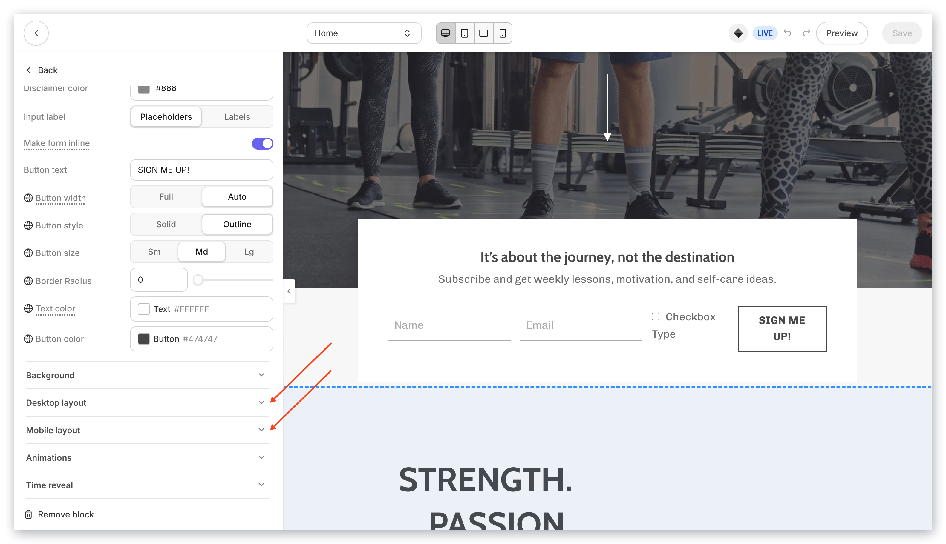
Customizing the section desktop layout
To access the section desktop layout settings
- Open the Website tab from the Dashboard.
- Select either Website Pages or Landing Pages.
- Open the page editor for your Page. Learn more
- Navigate to the sidebar editor and select the Section you wish to customize.
- Navigate to the Section Settings and click Desktop Layout:
Desktop layout settings
Customize your Desktop Layout Settings to optimize your users’ experience with the Section when viewed on a Desktop device.Hide section
Hiding a Section in your Desktop Layout Settings will make the specified Section invisible (or hidden) to users viewing the Section on a Desktop device. If sections remain hidden unintentionally, verify that the ‘Hide Section’ setting is configured correctly in your page editor to resolve visibility issues. Test out this setting by simply checking and unchecking Hide Section when viewed with the Desktop Preview (located in the bottom right corner of the Template Editor) and watch as your Section disappears and reappears before your eyes: Ensure your changes are saved after testing to retain visibility adjustments.Desktop section padding
Customize the padding inside the Section with your desired values. Changing your Section Padding will shift all Blocks in the Section to your desired appearance. To reset your padding values to the default setting, simply delete your custom value:Vertical alignment
Selecting a vertical alignment (Top, Center, Bottom) in a Section vertically aligns all Blocks in the Section to the tallest Block in its row:Horizontal alignment
The Horizontal Alignment setting shifts the Blocks in the Section to align horizontally with the 12-column grid. The Horizontal Alignment setting can be set to Left, Center, or Right aligned or create Space Between or Space Around all Blocks in the Section:Equal height blocks
Enable Equal Height Blocks in your Section Desktop Layout Settings to adjust all Blocks in the Section to align together at the top of the Section. Enabling this feature will adjust the Blocks to be equal height and align together at the top:Note: Enabling Equal Height Blocks will not change the height of your uploaded images, in order to retain the original image ratio. Instead, each image will vertically align to the top of the tallest Block in its row.
Make section full width
Enabling this setting will cause the Section to fill the full width of your users’ browser windows. This will adjust all content within the Section to adjust to the size of the browser window:Make section full height
Similar to making the Section Full Width, enabling this setting will cause the Section to fill the full height of your users’ browser windows:Customizing the section mobile layout
To access the section mobile layout settings
- Open the Website tab from the Dashboard.
- Select either Website Pages or Landing Pages.
- Open the page editor for your Page. Learn more
- Navigate to the sidebar editor and select the Section you wish to customize.
- Navigate to the Section Settings and click Mobile Layout: