Overview
Kajabi Cart enables customers to purchase multiple products in a single transaction, creating a streamlined shopping experience that can increase average order value and customer satisfaction. Kajabi Cart transforms the sales process by allowing customers to browse offerings, add multiple items to their cart, and complete a single checkout. This article covers best practices for storefronts, offer detail pages, coupon strategies, and cart optimization techniques.
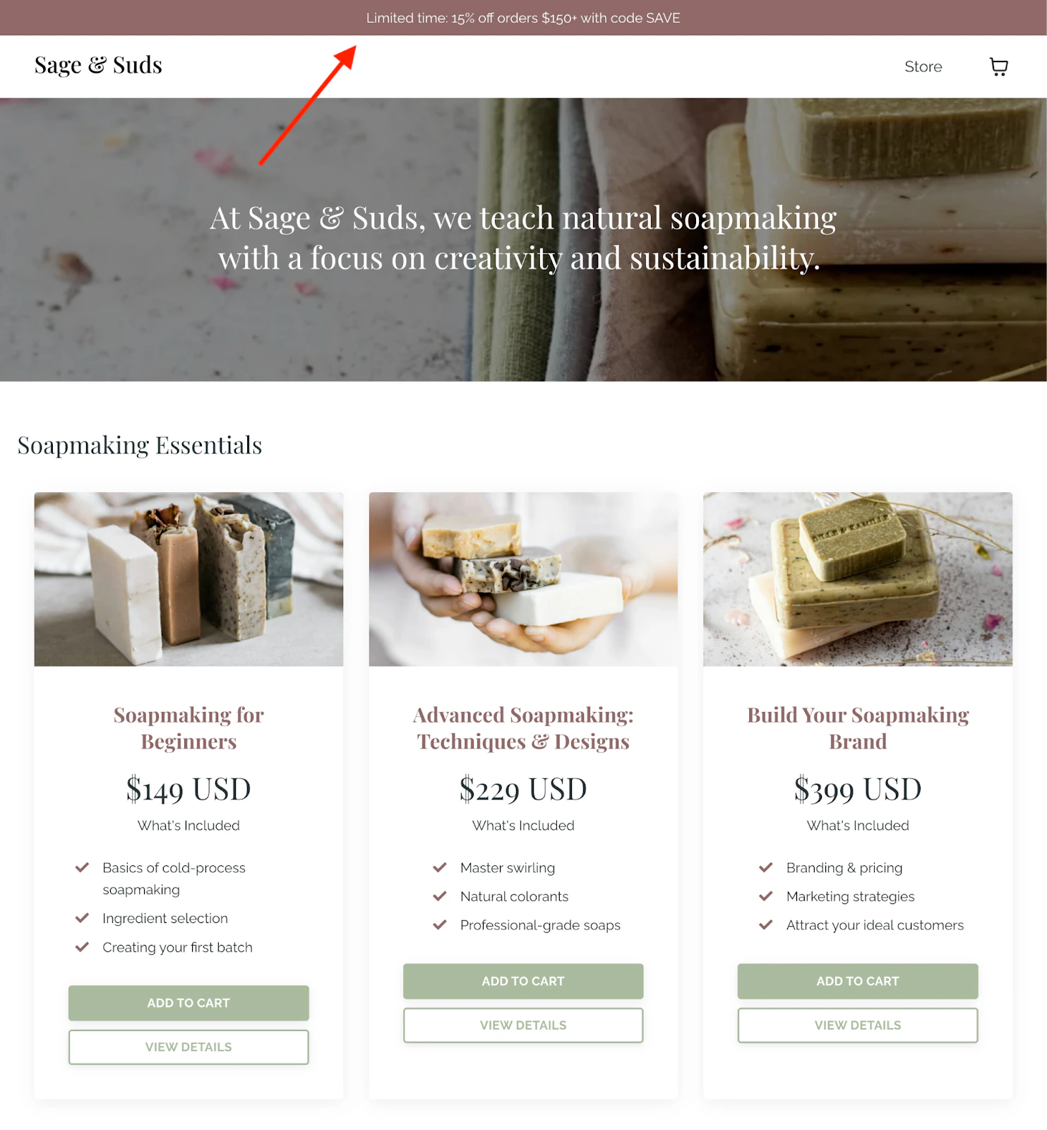
Storefronts
Storefronts serve as the central hub where customers can browse and discover your products.
Create an effective storefront
A well-designed storefront helps customers find what they need quickly:
- Organize by category: Group similar products together for easy browsing
- Use clear product images: High-quality visuals help customers understand what they’re purchasing
- Write compelling descriptions: Highlight key benefits and outcomes for each product
- Display pricing clearly: Show prices upfront to set expectations
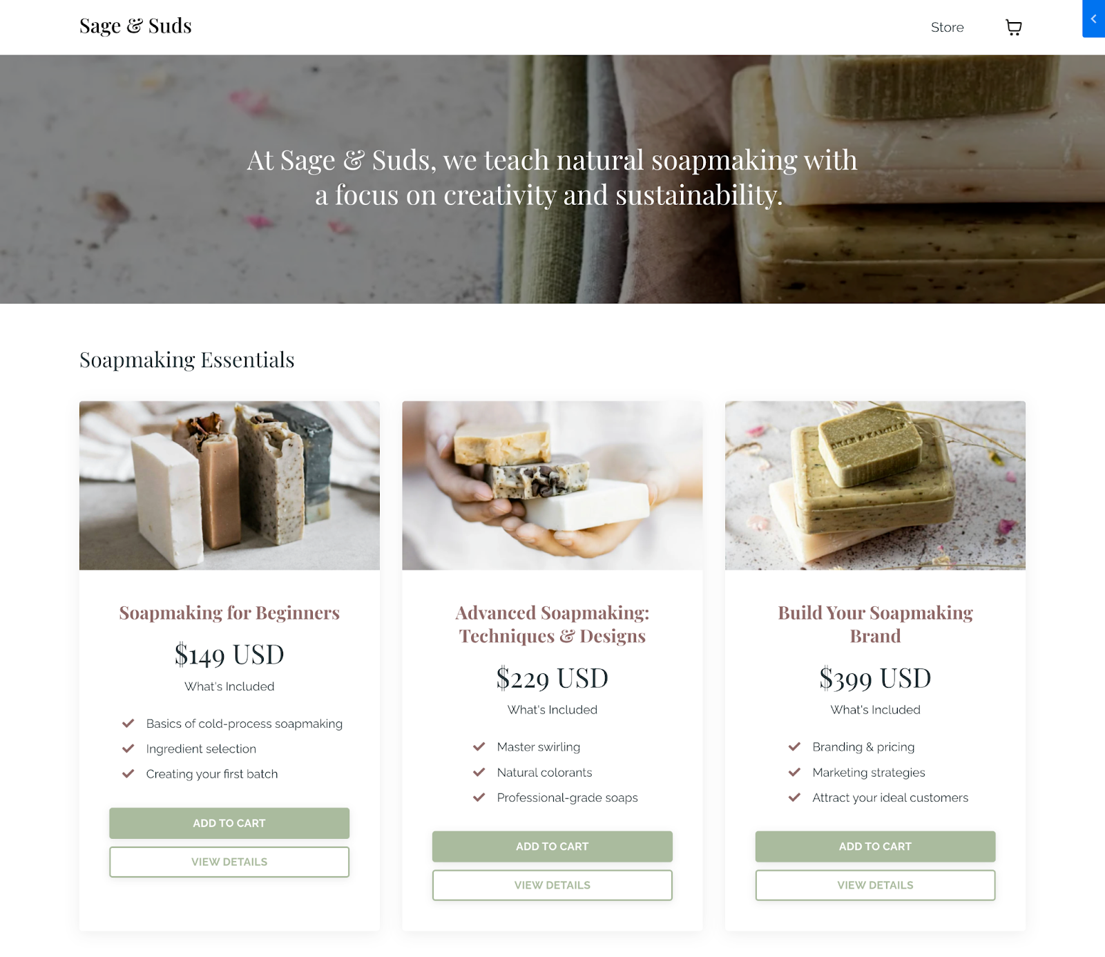
Storefront best practices
- Feature your most popular or flagship products prominently
- Include product reviews or testimonials when available
- Use consistent branding across all product listings
- Keep your storefront updated with current offerings

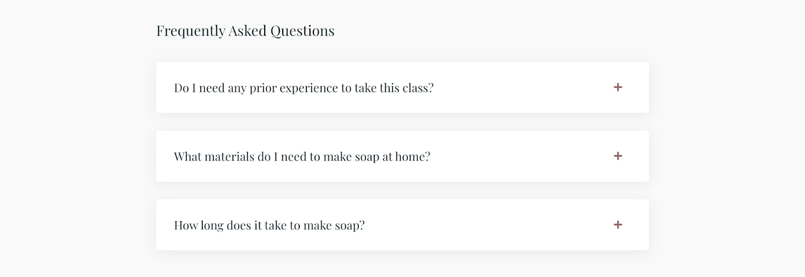
Offer detail pages
Offer detail pages provide in-depth information about individual products and play a crucial role in converting browsers into buyers.
Essential elements
Every effective offer detail page should include:
- Clear product title: Communicate exactly what customers are getting
- Detailed description: Explain features, benefits, and what’s included
- Pricing information: Display all pricing options clearly
- Add to cart button: Make it easy for customers to take action
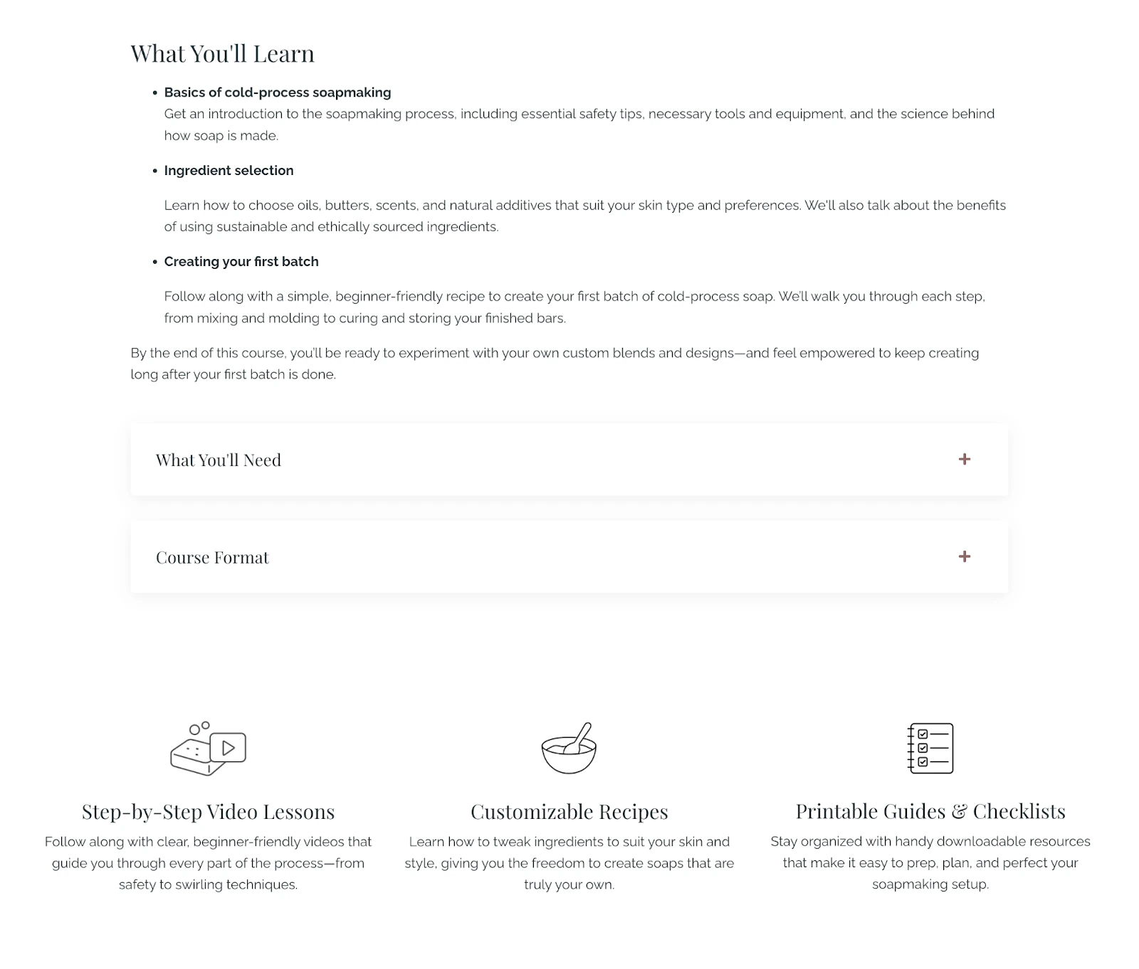
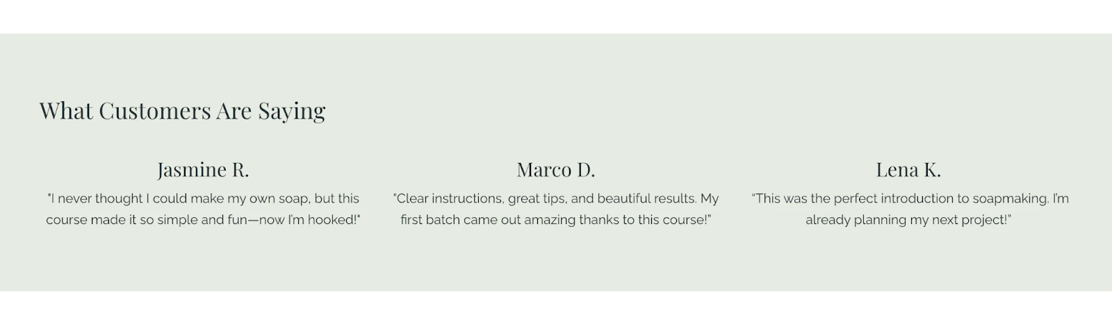
Optimize offer pages
- Use benefit-focused headlines that speak to customer outcomes
- Include social proof such as testimonials or student success stories
- Address common objections directly on the page
- Provide clear information about what happens after purchase
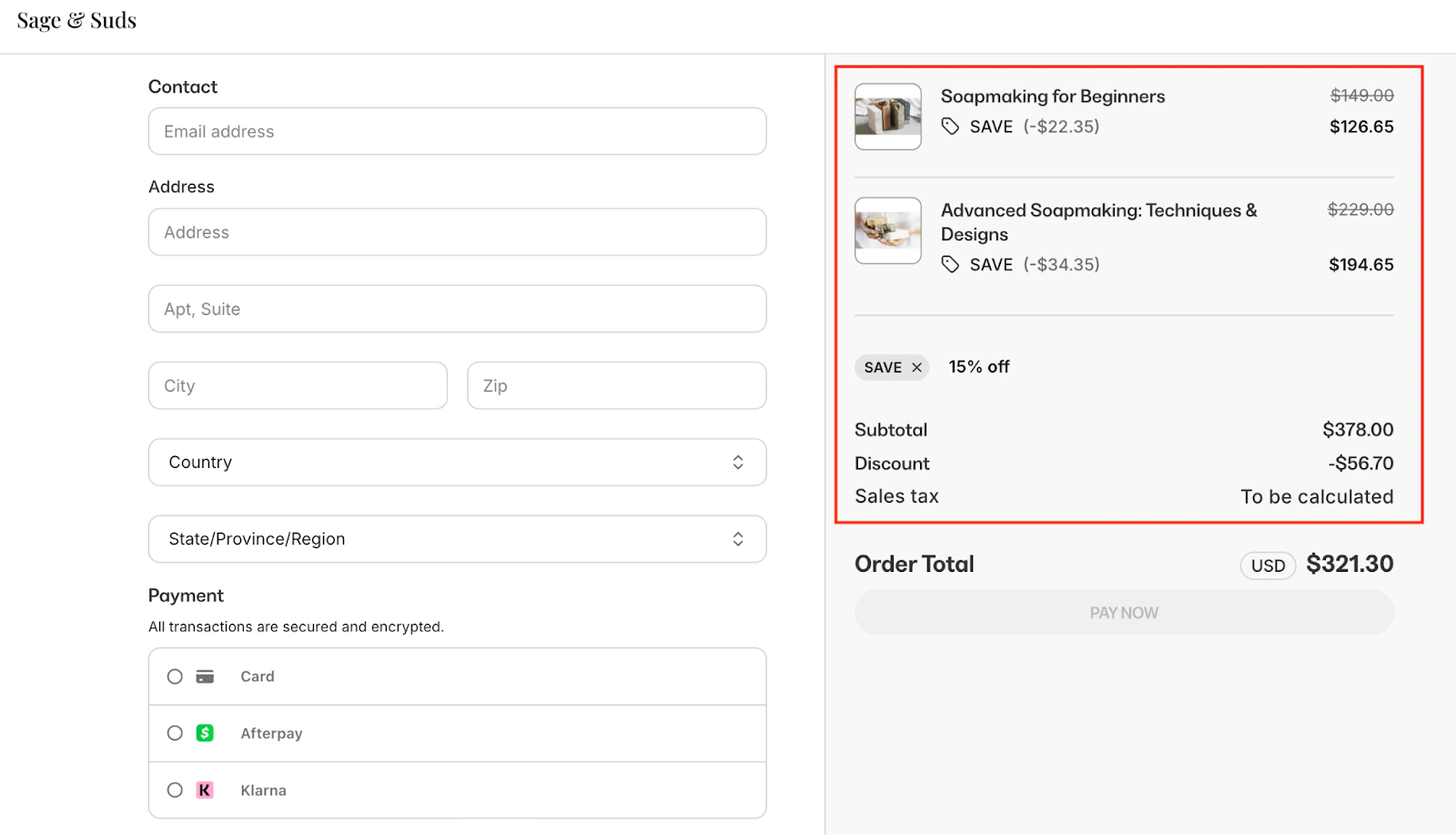
Coupon strategies
Strategic use of coupons can drive sales, encourage larger purchases, and reward loyal customers.
- Percentage discounts: Offer a percentage off the total purchase
- Fixed amount discounts: Provide a specific dollar amount off
- Bundle discounts: Encourage customers to purchase multiple products
- Limited-time offers: Create urgency with expiration dates
Coupon best practices
- Set clear terms and conditions for each coupon
- Use memorable, easy-to-type coupon codes
- Track coupon performance to understand what resonates with your audience
- Consider minimum purchase requirements to increase average order value
Cart optimization
Optimizing your cart experience reduces abandonment and increases completed purchases.
Reduce cart abandonment
- Simplify the checkout process: Minimize the number of steps required to complete a purchase
- Display trust signals: Show security badges and payment icons
- Offer multiple payment options: Give customers flexibility in how they pay
- Show clear pricing: Include taxes and fees upfront when possible
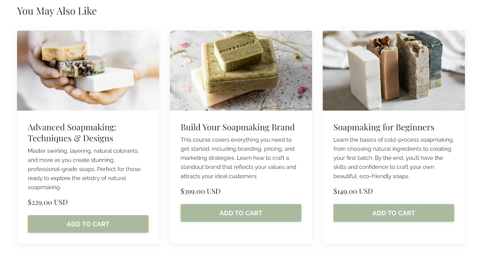
Increase average order value
- Suggest related products: Show complementary items customers might want
- Offer bundle discounts: Incentivize purchasing multiple products together
- Use order bumps: Present additional offers at checkout
- Implement upsells: Offer premium versions or add-ons
Measure and improve
Track key metrics to continuously improve your cart and checkout experience:
- Cart abandonment rate: Percentage of carts that don’t convert to purchases
- Average order value: The typical amount customers spend per transaction
- Conversion rate: Percentage of visitors who complete a purchase
- Coupon redemption rate: How often customers use discount codes
Tip: Regularly review your cart analytics to identify opportunities for improvement. Small optimizations can lead to significant increases in revenue over time.

