

A well-designed logo has a significant impact on how an app appears on mobile device screens. The examples below highlight effective and ineffective design choices for Branded Mobile App logos.Documentation Index
Fetch the complete documentation index at: https://help.kajabi.com/llms.txt
Use this file to discover all available pages before exploring further.
Elements of a good mobile app logo
Logos that work best for mobile apps tend to have:- High image quality/resolution
- Little or no text
- A simple design
- Identifiable even when small
- Low image quality/resolution
- A large number of text characters
- A complex design
- Degraded appearance at small file sizes
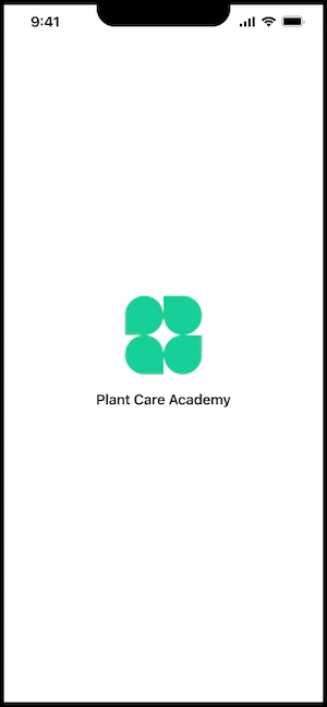
Good mobile app logo example
Here’s an example of an effective mobile app logo. This logo has a simple design that looks good at a small file size, and no text:

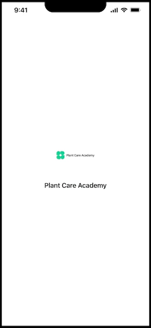
Bad mobile app logo example
Here’s an example of an ineffective mobile app logo. This logo has too much text and doesn’t look good at a small file size:
Specifications
- JPG or PNG
- Minimum 300 x 300px