

Open the Email Visual Editor
How you reach the editor depends on whether you are editing an Email Broadcast or an email inside an Email Sequence.Open the editor from an Email Broadcast
- Open the Marketing tab from the Dashboard.
- Click Email Campaigns.
- Select the Email Broadcast you want to edit.
- Move your cursor over the email content and click Edit content.
Open the editor from an Email Sequence email
- Open the Marketing tab from the Dashboard.
- Click Email Campaigns.
- Select an Email Sequence, then click the title of the email you want to edit.
- Click Launch Email Editor above the body of the email.
Note: When you edit an email you created earlier, the editor shows the section types that existed when that email was created. Create a new Email Broadcast or Email Sequence email to use the current set.
Add a section
Every section type is added the same way.- In the editor sidebar, click Add section.
- Click a section name. It generates at the bottom of the email.
- Then, click Add to open its options.
- Configure the section.
- Click Save to keep your changes.
Rearrange a section
New sections generate at the bottom of the email, so move them into the order you want afterward.- In the editor sidebar, find the section you want to move.
- Click and hold the drag handle beside the section name.
- Drag the section to its new position and release it.
- Click Save to keep your changes.
Section actions
Move your cursor over a section in the sidebar list to reveal its more options (…) menu, which holds four actions.- Rename changes the name the section shows in the sidebar list
- Duplicate creates a copy of the section. This is unavailable on sections that can only appear once in an email.
- Hide removes the section from the email without deleting it. The option reads Show once the section is hidden.
- Delete removes the section. This is unavailable on sections the email requires.
Note: Hide in this menu hides the section on every device. To hide it on one device only, use the Hide Section checkbox in Desktop Layout or Mobile Layout instead. Delete does the same thing as Remove section at the bottom of the section’s settings.
Section settings
Every section carries the same layout settings at the bottom of the sidebar editor, plus a background color setting whose group name depends on the section type. Background — on most sections — or Appearance — on the Text and Text, Image and Text, and Image and Image sections — sets the section’s background color. Click the dropdown, then enter a hex code, pick from your Color Scheme, or choose a color from the color picker. Learn how to edit the section background. Desktop Layout controls how the section appears on a computer:- Hide Section removes the section from the desktop view
- Padding Desktop adjusts the spacing around the section’s content
- Hide Section removes the section from the mobile view
- Padding Mobile adjusts the spacing around the section’s content
Link destinations
Seven sections let you make their content clickable, and all seven offer the same five destinations. The field is called Image Action on the Image, Logo, Image and Image, and Image and Text sections, Link Action on the Button section, Video URL on the Video section, and Action on the Announcement section. The Text, Countdown, Social Icons, Divider, and Text and Text sections have no destination setting.- Go to a Landing Page sends the contact to a Landing Page on your Kajabi site
- Go to a Checkout Page sends the contact to the checkout page for an Offer
- Download a file gives the contact a file to download
- Go to a URL sends the contact to any web address. Enter the full URL, including
https:// - Open Popup Checkout opens a checkout in a popup rather than sending the contact to a separate page. This is not available in Email Broadcasts.
Text section
Text is where the work of email marketing happens, guiding the reader from initial interest to taking action. Add a Text section to communicate with contacts, market your content, and describe your value.Format text
Bold, Italic, Underline, and Strikethrough style the text you have selected: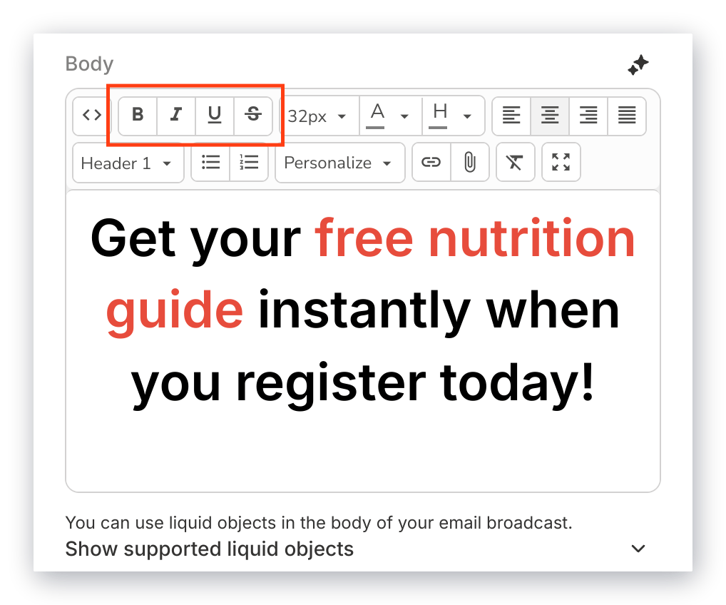
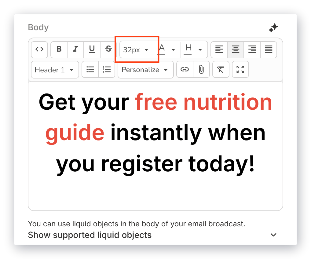
- Text color and Background color color the selected text or its highlight
- Format applies Paragraph or Header 1 through Header 6
- Bulleted list and Numbered list organize your content into lists
- Alignment positions text to the left, center, or right, or justifies it
- Clear Formatting strips formatting that came in with text pasted from a Word document or another website
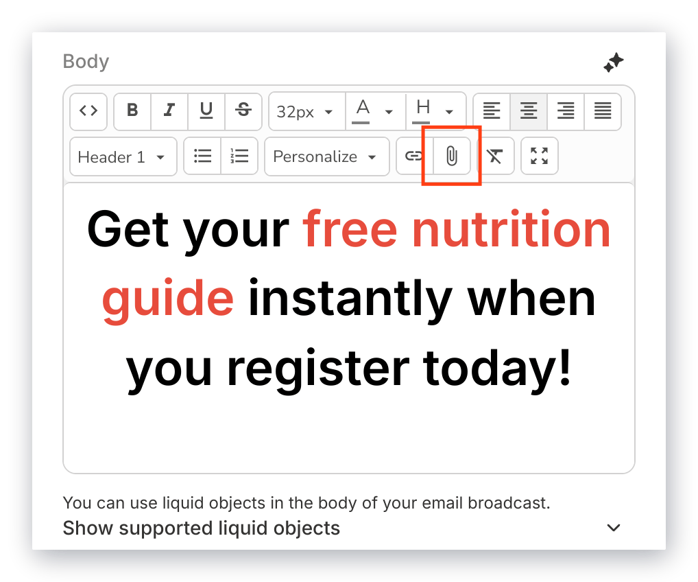
Insert links, files, and contact details
Personalize inserts customer information captured through your Forms and converted to Liquid Objects: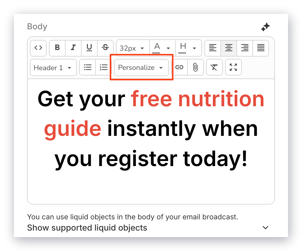
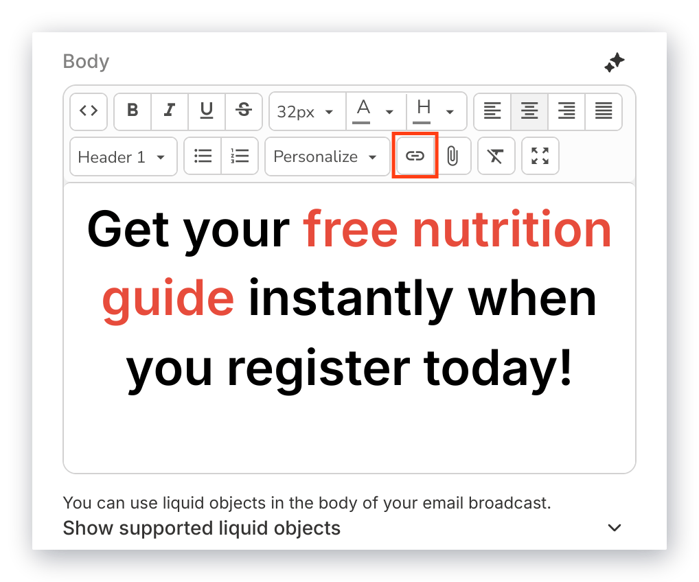
Editor tools
Content Assistant opens Cofounder, Kajabi’s AI assistant, to help generate your text content. Learn more about Cofounder. Source code lets you modify the section’s HTML directly: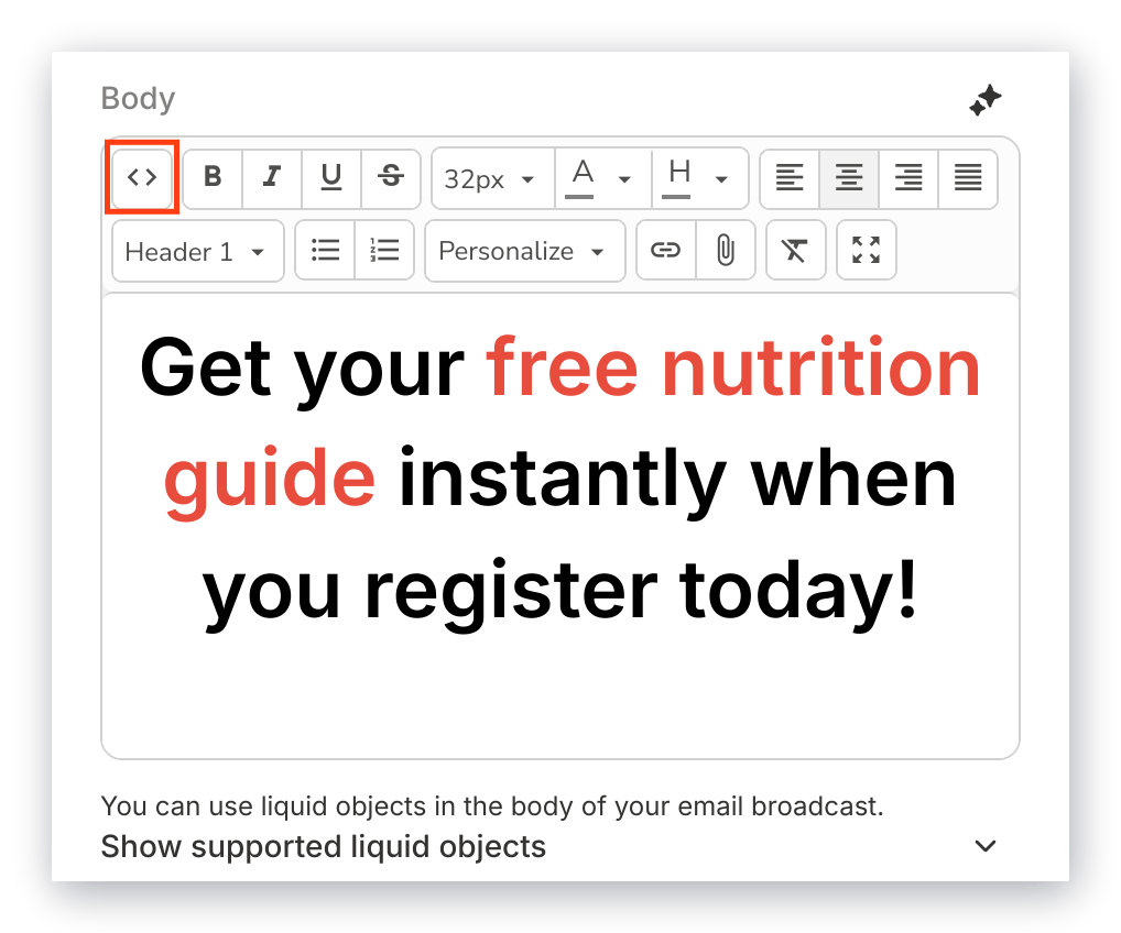
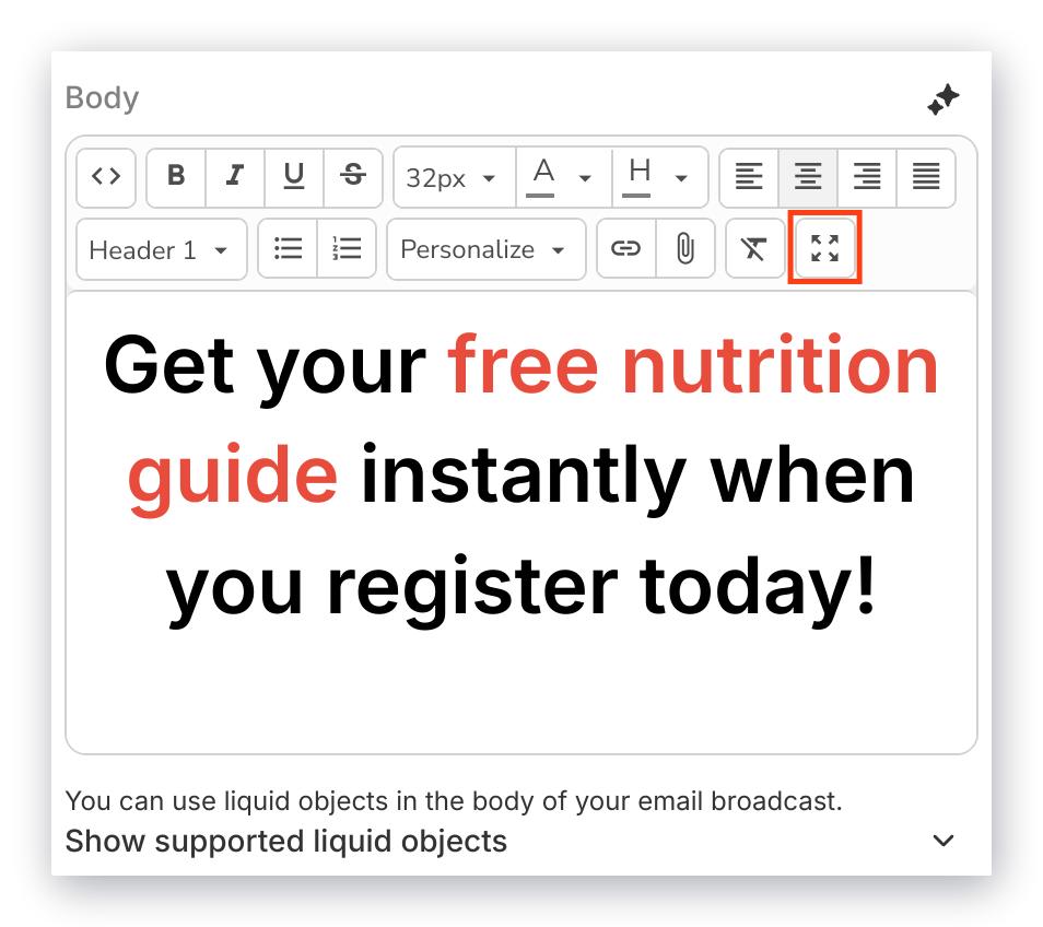
Image section
Pictures are worth a thousand words. Use an Image section to set a tone for your emails, show your personality, add a handwritten signature, or display what your business has to offer.- Image holds your picture. Click Select Image and upload the file you want to use.
- Image Action sets where clicking the image sends your contact. The choices are listed under Link destinations above.
- Image Alt Attribute is a brief description of the image, used for SEO and shown if the image cannot load.
- Width and Alignment, both in Desktop Layout, size and position the image on a computer.
Note: Images render full width on mobile devices regardless of the width you set for desktop.
Button section
Use a Call to Action (CTA) Button to encourage contacts to open a page, purchase an Offer, and more.- Link Text is the text shown on the button
- Link Action sets where the button sends your contact. The choices are listed under Link destinations above.
- Button Background and Button Text Color set the button’s colors
- Button Type chooses a Solid fill or an Outline
- Border Thickness sets the weight of an outlined button’s border
- Button Size chooses Small, Medium, or Large
- Border Radius ranges from square to fully rounded corners
- Alignment positions the button to the left, center, or right
Note: Buttons render differently across email clients. In Outlook, the Border Radius is ignored and the button displays full width.
Logo section
A logo is a primary visual identifier. Aside from your email address and subject line, it is the first visual impression a contact gets, which is why the most popular placement is at the top of the email.- Image holds your logo. Click Select Image and upload the file you want to use.
- Image Action sets where clicking the logo sends your contact. The choices are listed under Link destinations above.
- Width sets the size of the logo. Use the format
540pxor simply540. The editor recommends a width of 330px. - Image Alt Attribute is a brief description of the logo, used for SEO and shown if the image cannot load.
- Alignment positions the logo to the Left, Centered, or Right.
Video section
A Video section creates a clickable image that sends recipients to a separate page to watch your video. Email clients do not play video inline, so the thumbnail acts as the link.- Video Thumbnail is the image recipients see and click. Click Select Image to upload one; a default image is used if you skip it.
- Video URL sets where the thumbnail sends your contact. The choices are listed under Link destinations above.
- Show Overlay and Overlay Color tint the thumbnail
- Show Play Button and Play Button Color add a play button on top of the thumbnail
Countdown section
A Countdown creates urgency around an event by showing the time remaining until it starts.- Select Your Event connects the countdown to an Event on your site. This is required — the countdown has nothing to count down to without it.
- Countdown Style chooses Round, Square, Pill, or Plain
- Accent Color and Text Color match the timer to your branding
- Image Alt Attribute is a brief description shown if the timer cannot load
- Alignment positions the timer to the left, center, or right
- Countdown Width, in Desktop Layout, sizes the timer on a computer
Note: The countdown does not support transparent colors and will not display correctly with an RGBA value. Use a Hex or RGB color for the accent, text, and background.
Social Icons section
Showing links to your social accounts is a free way to send email readers to your other channels. Enter the URL of each account you want to display in its matching field. Only the networks you fill in appear in the email. Fields are available for Facebook, Instagram, YouTube, TikTok, LinkedIn, X, Pinterest, Snapchat, Vimeo, Github, Soundcloud, Tumblr, Flickr, and Dribbble.- Social Icon Style sets the icon colors and borders
- Social Icon Size chooses Small or Large
- Alignment positions the icons to the left, center, or right
Divider section
Break your content into easily consumable pieces with a divider.- Divider Height sets the thickness of the line. Use the format
5pxor simply5. The default is2. - Divider Color sets the color of the line using the color picker.
Announcement section
An Announcement is a banner for information you want a reader to see before anything else, such as a schedule change or a deadline.- Text is the announcement copy
- Text Color sets the color of that copy
- Action makes the banner clickable. The choices are listed under Link destinations above.
- Alignment positions the text to the left, center, or right
Text and Text section
A wall of text makes reading harder. The Text and Text section places two blocks of text side by side in a 2-column format on desktop, stacked vertically on mobile, so related content stays together without scrolling.- Body 1 and Body 2 hold the text for each column, with the same options as the Text section
- Vertical Alignment aligns the two blocks to Top, Middle, or Bottom
- Gutter Width, in Desktop Layout, sets the space between the columns on desktop
- Gutter Height, in Mobile Layout, sets the space between the blocks on mobile
Image and Image section
Place two responsive images side by side in a 2-column format on desktop, stacked vertically on mobile.- Image 1 and Image 2 hold your two images. Click Select Image under each and upload the file you want to use.
- Image 1 Action and Image 2 Action set where clicking each image sends your contact. The choices are listed under Link destinations above.
- Image Alt Attribute is a brief description of the image. Both fields carry this same label — the first belongs to Image 1, the second to Image 2.
- Vertical Alignment aligns the two images to Top, Middle, or Bottom
- Gutter Width, in Desktop Layout, sets the space between the images on desktop
- Gutter Height, in Mobile Layout, sets the space between the images on mobile
Image and Text section
Pair an image with text to show and tell your story in the same section.- Image 1 holds your image. Click Select Image and upload the file you want to use.
- Image 1 Action sets where clicking the image sends your contact. The choices are listed under Link destinations above.
- Image Alt Attribute is a brief description of the image, used for SEO and shown if the image cannot load.
- Body holds the text, with the same options as the Text section
- Vertical Alignment aligns the image and text to Top, Middle, or Bottom
- Image on the Left, in Desktop Layout, chooses whether the image or the text sits on the left
- Gutter Width, in Desktop Layout, sets the space between the image and text on desktop
- Image on Top, in Mobile Layout, chooses whether the image or the text sits on top
- Gutter Height, in Mobile Layout, sets the space between the image and text on mobile
Note: Image on the Left only changes the desktop view. To control which comes first on a phone, use Image on Top in Mobile Layout.